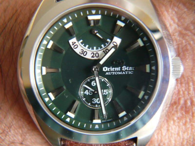
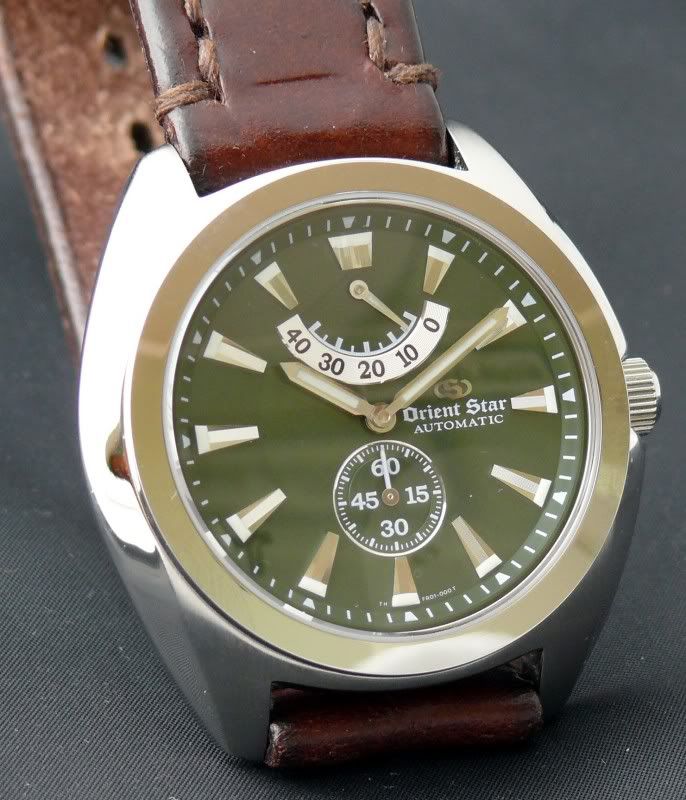
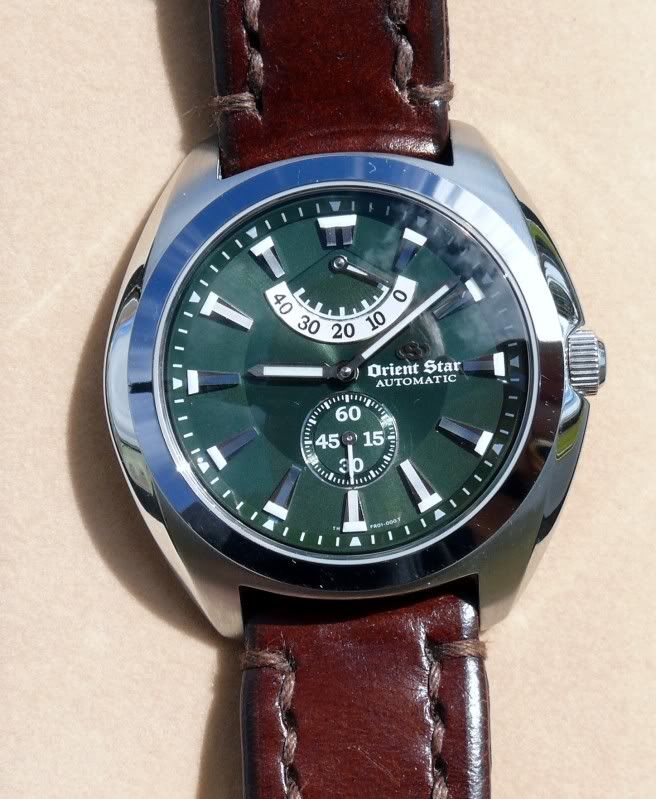
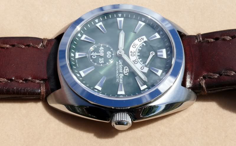
This is one really nice cushioned cased watch. It has a beautiful green dial that has proven to be difficult to photograph due to reflection from the domed crystal. The leather strap is nice and thick, but comfortable, and is made by Somes for Orient. Somes are a company that make leather harnesses and other products for horses.
Specifications:
Automatic winding. Non Hacking. Non hand-winding
21 Jewel automatic movement
Power Reserve Indicator
40 hours reserve
Accuracy +25 seconds ~ -15 seconds
43mm case diameter, 45mm including crown
14mm width from case back to top of crystal
47mm tip of lug at 12 position to tip of lug at 6 position
33mm crystal diameter
20mm wide honey coloured strap. 4mm thick. Sewn in keeper loop
Weight of 94 grams.
Spherical domed Sapphire glass crystal with non-reflective coating
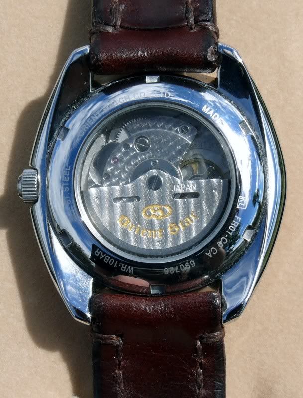
See through case back (composition of back crystal unknown)
Screw-down case back
Waterproof 100 metres
Luminescent hour, minute and power reserve hands and (hour) indices
1 comment:
Hi
I'm pretty much brand new to this whole horological obsession (though not so green as to be without strong personal preferences!) and I certainly admire your collection of Orients.
I've read many comments about the fantastic build quality, finsihing and unmatched value for money that Oreint automatic timepieces deliver, and have been very impressed by the limited dive range that I've researched - the Mako's, Beasts and those wonderful 300m divers that bear such striking yet complimentary resemblance to the Seiko Sumo.
The WZ0061FR that you included in your catalogue on the 21st drives me to ask a couple of questions about how you yourself see Oreint's aestheic.
The cushion case has nice, not too distinct angles, and the applied, chromed (I call them 'mirrored') indices remind me of those on the SS Samurai. The dial colour is a wonderful hunter green, which is of course why the Somes leather strap seems so perfect.
What I'd really like to ask about is the style of the lettering & printed numbers on this, and many Orient watches. Many of the Orient Stars have very clear, classic typeface choices, the WZ0061FR however displays an almost gothic type that I've noticed before on Orients. For me it really marks these wathces out. Is it a stylistic thread that goes back to much earlier pieces?
Post a Comment